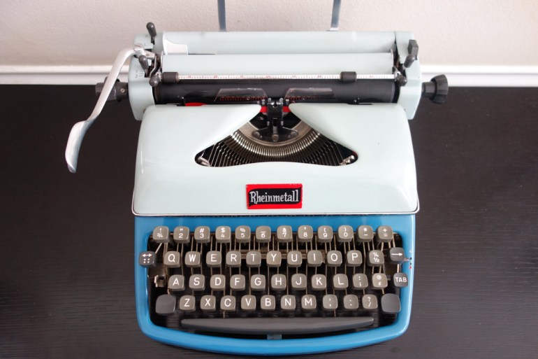
A couple weeks ago I ventured into the mist-shrouded hills of San Francisco where I bought a 1961 East German Rheinmetall KsT from a pair of hill sprites (or Houses of the Holy photo shoot extras). I continue to clean and tinker with the KsT. I got spools that fit on its three-pronged spindle and went to town typing.
I sure love the way this Rheinmetall KsT types. Solid and classy with a nice snappy *snack* and a big, readable imprint. I am riding a wave of smooth class. I am very glad that it’s got a QWERTY keyboard.
I recently cleaned and re-ribboned a 1924 Corona 3, and I was not a fan of that particular machine. Beautiful and strange though it was, typing on the Corona 3 was an alarming experience. I felt as though I were in a Model T on a dirt road that might at any given moment break an axle and fly into a million pieces. And me with no seat belt. And the threat of a rigid steering column straight into the sternum. What a rattly old ride that Corona 3 was. It typed just fine in a wobbly sort of way once it was de-gummed, but I was relieved to return it to its owner. I can’t believe I said that about a typewriter.
On the other hand, the Rheinmetall KsT is a delight to use. It cleaned up so beautifully and types so competently. I am discovering that I really love the mid-sized portables of the 1950s and 1960s. I also really like big heavy standards, no matter the age.
I removed the foil dealer’s sticker that was plastered on the typewriter’s forehead. I know that this sticker is a part of the typewriter’s history, but I couldn’t get over how bad it looked. I also knew that it would compete with the cool Rheinmetall badge that would soon be re-attached to the ribbon cover.
I carefully pealed the foil dealer sticker from the side while I warmed the sticker’s adhesive underbelly with a hair dryer.
Fortunately, I did not damage either the paint on the ribbon cover or the foil sticker which I relocated to the the interior side of the ribbon cover:
Quality and Origin
I think that I have made some headway into the mystery of the “S” in the triangle on the back of the Rheinmetall. A commenter on the last post, mentioned that he had seen similar markings on East German weapons and that set me off on a chase.
“S” = “Sonderklasse für sehr gute Qualität (Special class for very good quality)”
“09” = The first two digits indicate the territorial base key of the district. 09 is the district of Erfurt where the Sömmerda factory was located.
“2552” = operating point / production facility, perhaps the Sömmerda Rheinmetall factory itself.
Vertical Alignment
The KsT had a few little issues that bothered me. One was that the vertical alignment was a bit off:
Weirdly, I don’t think this lower case “h” has a serif at the top of its stem.
Ted Munk has a couple really good posts on adjusting vertical type alignment on both basket shift and carriage shift typewriters. Unfortunately, this carriage shift Rheinmetall doesn’t seem to have the adjustment points that his carriage shift machines have.
I had taken the platen knobs and side covers off for cleaning and de-gumming of the carriage release button. I noticed two interesting screws on either side of the platen that seem to limit shifting. I loosened the lock nuts and made small adjustments to see what would happen.
Yeah, Baby!
After the fact, I found a West German Alpina service manual in the repair documents library at Typewriter Database. Funny how the schreibmaschine is typing “schreibmaschine”:
My Google Translate German is a little rusty, but I think it says: 01.0202 and 01.0209 of Fig. 1 are the adjustment points for upper and lower case letters. The West German Alpina appears to be very similar to my East German Rheinmetall – at least in terms of vertical text alignment.
Filling Key Depressions with Sugru
One thing that really bothered me was the empty “D” key. It looked like a missing tooth.
I pulled out the Sugru:
And fixed that thing:
Missing Handle
The carrying case is in rough shape and the handle is missing.
I found this site that sells luggage handles – hmmm – great selection of handles!
B-bird Is the Word
This Rheinmetall KsT has a variant logo badge made of thin metal which is very different from the typical Rheinmetall logo. The badge had fallen off some time ago and had gotten lodged inside the machine. I could see the ghostly outline of where the badge had been before it fell off.
I reapplied the Rheinmetall badge with its jaunty surfing font to the ribbon cover. I used Krazy Glue and that made me krazy nervous, but I think I positioned it in the right place.
Ah, SurfMetall – such laid-back swagger! I pay tribute to your überkoolness.
I leave you now with a little surfmetall:


